App & Responsive Website: PHASE
PROJECT OVERVIEW
End-to-End UX Designer (Independent Project): product design, user research, wireframing, prototyping.
Role:
January, 2025
Time:
Phase is a currency exchange and banking app designed for seamless international transactions. With vertically integrated multi-currency bank accounts, users can easily transfer and exchange funds across countries. Features like an ATM locator and gamified forex tracking enhance accessibility and engagement, making global banking faster, more affordable, and intuitive.
Product:
Goal
This project aimed to design a user-centered banking and currency exchange app that empowers young adults living and studying abroad to seamlessly manage their finances across currencies. By offering real-time exchange rate tracking, transparent fee structures, and efficient USD-GBP transfer capabilities, Phase aims to alleviate financial anxieties and facilitate stress-free daily transactions for international students. Effectiveness will be measured through user engagement, transaction volume, and customer satisfaction metrics.
Problem
This project addresses the challenge faced by international students who rely on traditional banking and exchange services that often involve high fees, slow processing times, and complex procedures. Phase aims to provide a solution that simplifies currency exchange, reduces financial anxieties, and enhances the overall experience of living and studying abroad.
USER RESEARCH

Understanding the needs and frustrations of expats when managing their finances across currencies was crucial to designing an effective and user-friendly app. To achieve this, I embarked on a user research journey that involved delving into the lives and experiences of real people grappling with the challenges of international money transfers. This section outlines the key findings from my research, which served as the foundation for the design decisions that shaped the Phase app.
Audience
Phase isn't for everyone. It's specifically designed for a unique group of people – those who are navigating the exciting, yet sometimes challenging, waters of living and studying abroad. These are individuals who refuse to let financial anxieties hold them back from embracing new cultures and experiences. They're tech-savvy, globally-minded, and eager for a banking solution that seamlessly integrates with their dynamic lifestyle. They crave simplicity, transparency, and efficiency when it comes to managing their money across borders. In this section, I'll delve deeper into the specific needs and motivations of the Phase audience, painting a clear picture of the individuals I aim to empower.
Personas
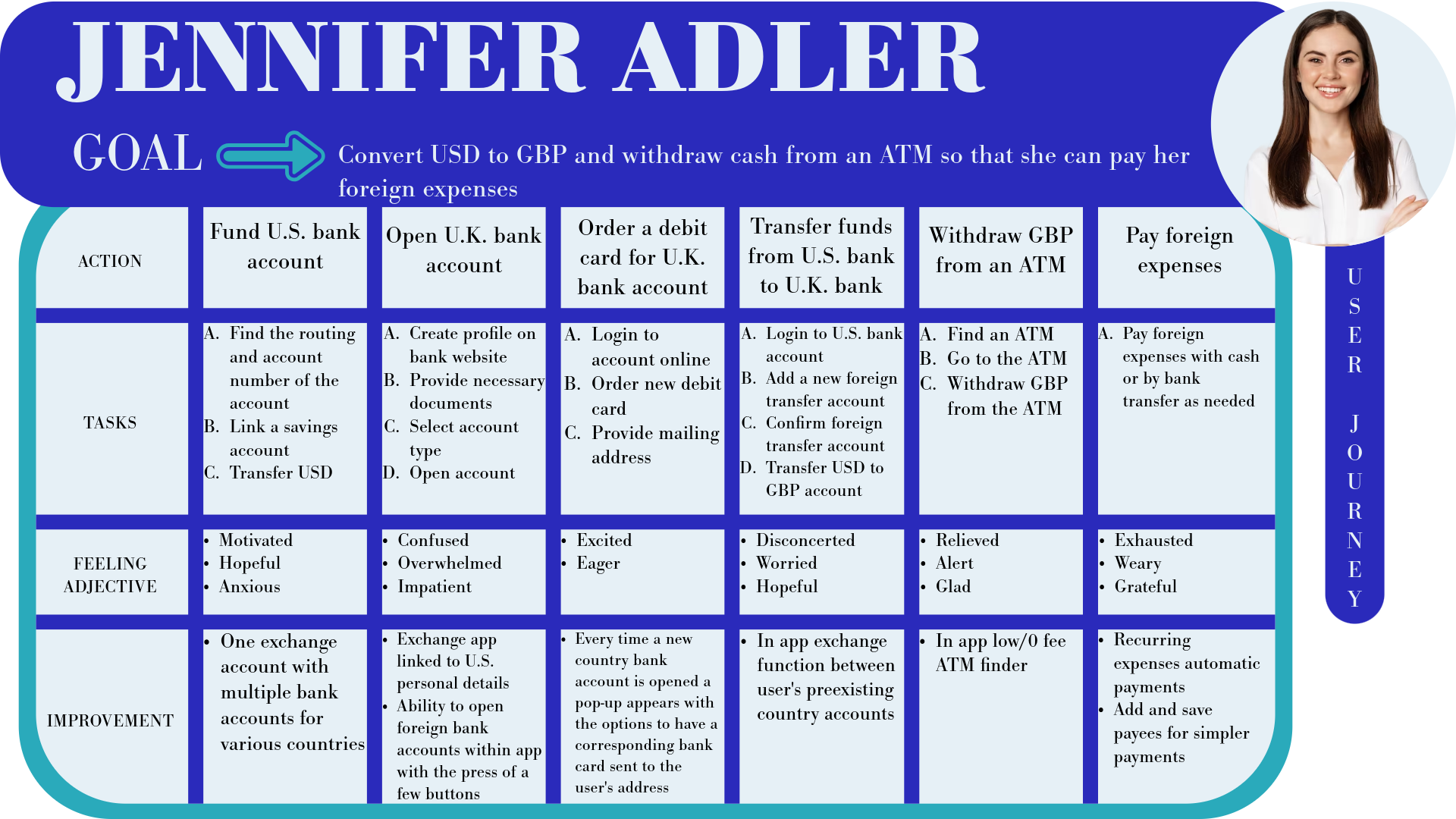
Meet Jennifer. She's a bright, ambitious 22-year-old who's taken a leap of faith to pursue her post-graduate studies in the UK. While she's thrilled about this new chapter, she's also facing the realities of managing her finances in a foreign currency. From paying rent and tuition to enjoying the occasional pub night with friends, Jennifer needs a reliable and stress-free way to handle her money. Let's dive deeper into Jennifer's world and discover what makes her tick.

Empathy Maps
Empathy maps help visualize users' psyches, enabling a deeper understanding of their needs and pain points to inform user-centered design decisions.

User Stories

User stories inform more user-centered design decisions by assisting in the conceptualization of users' psyches, enabling a deeper understanding of the basis of users’ goals and the inhibitors to the fulfillment of users’ goals.
User Journeys

User journeys map out the steps users take to achieve their goals, highlighting pain points and opportunities to improve the overall user experience.
DEFINING THE PROBLEM
Defining user needs is an essential constituent of any effective design process. Through problem statements, hypothesis statements, and goal statements, this project identifies and addresses key user challenges, ensuring a user-centered methodology in the formation of value propositions that represent compelling design solutions.
Problem Statements
I have developed a problem statement for the user persona of Jennifer, defining her unique challenges and needs to create a focused and user-centered design solution. this problem statement, rooted in empathy and user research, helps identify key goals, constraints, and criteria that guide the design process. By clearly articulating what Jennifer needs and why those needs matter, this statement ensures that the design remains aligned with real user problems before moving into the ideation phase.

Hypothesis Statements
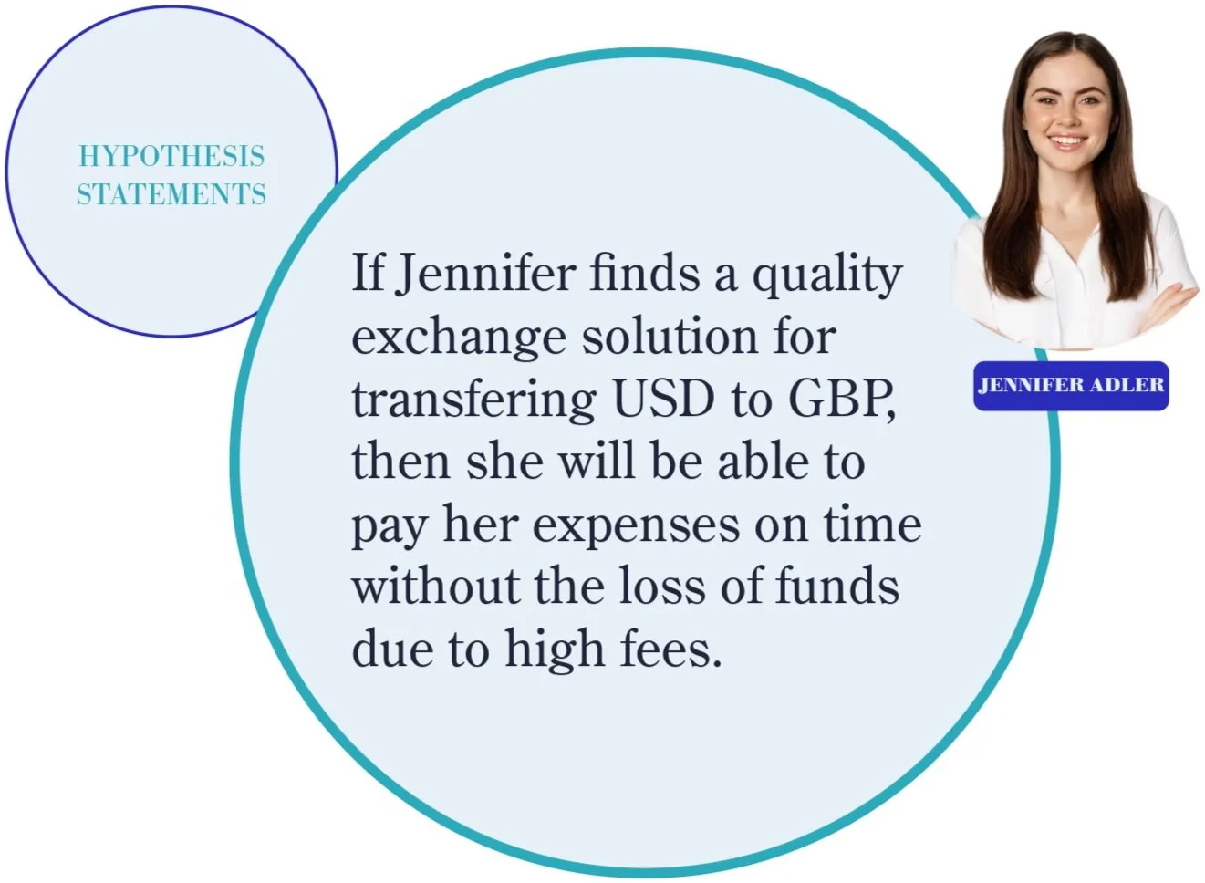
After identifying key user needs with a problem statement, I developed a hypothesis statements to propose potential solutions. This statement outlines how I might address user challenges and improve their experiences. By setting clear expectations for the impact of my design, the hypothesis statement provides a strong foundation for brainstorming, testing, and refining solutions in the next phase of the design process.

Goal Statements
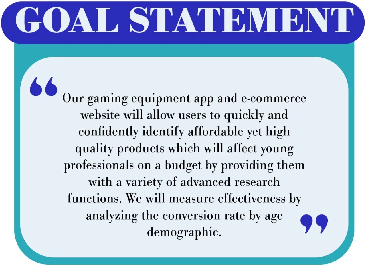
I developed a goal statement for Jennifer’s persona that transforms the hypothesis into clear, actionable objectives. This goal statement is designed to directly address user needs identified earlier in the problem statement, ensuring the product delivers the desired results. By setting specific targets, I can focus the design process on achieving meaningful outcomes that align with both user expectations and the project’s broader vision.

IDEATING SOLUTIONS
The ideation phase marks a critical step in the design process, where creativity and innovation take center stage. Building on the insights gathered from the user research, the problem statement, and goal setting, this phase encourages the generation of a wide range of potential solutions without judgment or limitation. I utilized a competitive audit, and brainstorming tactics to aid and expand upon design possibilities, understanding of industry trends, and spark fresh approaches to addressing user challenges. By exploring numerous ideas, the goal was to unlock the most effective and impactful solutions for the final product.
The Competitive Audit:
Objective
The audit aimed to assess the strengths and weaknesses of key competitors in the banking & exchange market to identify opportunities for differentiation and market positioning for a currency exchange service.
Competitors Analyzed

Wise
Direct Competitor

Revolut
Direct Competitor

N26
Indirect Competitor

Paypal/Xoom
Direct Competitor
Key Findings:
Product Offering
Wise and Revolut are similar, focusing on international money transfers and multi-currency accounts, while Revolut also offers trading. N26 is more of a digital bank with traditional features, and Paypal/Xoom is known for online payments and expanding into business solutions and "buy now, pay later."
User Experience
Wise: Clean and simple design with a focus on transfers, but might be too basic for some users. Mobile app is smooth and user-friendly, but lacks advanced features.
Revolut: Modern and polished design with a wide range of features, but could be overwhelming for some. Mobile app is outstanding with an all-in-one experience, but the vast number of features might intimidate new users.
N26: Minimalist design focused on simplicity, but lacks details on certain services. Mobile app is good for basic banking, but limited in advanced features.
Paypal/Xoom: Trusted but dated design, with an overcrowded interface. Mobile app is functional for basic transactions, but the cluttered interface and dated design are drawbacks.
Accessibility
Wise: Generally good accessibility with clear design and multiple languages, but lacks a formal accessibility policy.
Revolut: Good support for multiple languages and assistive technologies, but also lacks a formal accessibility policy.
N26: Simple design and various login options are beneficial for accessibility, but a formal accessibility policy is missing.
Paypal/Xoom: Decent color contrast and language options, but screen reader optimization and a formal accessibility policy are lacking.
Visual Design
Wise: Strong brand identity with recognizable elements, but lacks emotional connection and visual appeal.
Revolut: Outstanding modern and sleek brand identity, instantly recognizable and consistent across platforms.
N26: Clean and professional design, but lacks distinctiveness and memorability.
Paypal/Xoom: Needs improvement with a dated visual identity, generic color scheme, and low-resolution graphics.
Content
Wise: Clear and straightforward tone, with concise and informative content, but lacking depth in some areas.
Revolut: Energetic and bold tone, with detailed and comprehensive content, but can be overwhelming at times.
N26: Simple and approachable tone, with easy-to-follow content, but lacks detailed explanations for some financial tools.
Paypal/Xoom: Trustworthy and functional tone, with clear content for basic transactions, but lacks detail for advanced services.
Market Positioning
Wise: Focuses on providing affordable and transparent international money transfers, appealing to budget-conscious users.
Revolut: Positions itself as a modern, all-in-one financial app offering a wide range of services beyond just money transfers.
N26: Emphasizes simplicity and ease of use for everyday banking needs, targeting users who prefer a streamlined mobile experience.
Paypal/Xoom: Leverages its established reputation in payments to offer a trusted platform for global transactions and remittances.
Strengths
Wise: "The fairest way to send money abroad" (Emphasizes their commitment to transparency and low costs)
Revolut: "Your financial life, simplified" (Highlights the convenience of having all your finances in one place)
N26: "Banking that fits your life" (Focuses on the flexibility and user-centric approach)
Paypal/Xoom: "Send money with confidence, anywhere in the world" (Reassures users about security and global reach)
Weaknesses
Wise: Limited beyond money transfers.
Revolut: Overwhelming for new users.
N26: Fewer advanced features.
Paypal/Xoom: High fees for international transfers.
Gaps & Opportunities:
Comprehensive financial education: Integrate financial education into the platform for users at all levels.
Tax integration: Seamlessly integrate personal financial management with a tax filing tool.
AI-powered savings: Offer fully customizable multi-currency savings plans with AI-driven recommendations.
Enhanced accessibility: Provide enhanced accessibility features for users with disabilities, including in-depth screen reader optimization.
Real-time support: Offer real-time, in-app support for financial disputes or fraud resolution.
Develop gamified savings and budgeting tools to increase user engagement.
Offer loyalty or rewards programs tied to international spending or currency exchanges.
Introduce eco-friendly or socially responsible investment options within multi-currency accounts.
Expand offline access through partnerships with global ATM networks or retail outlets.
Enhance crypto-to-fiat exchange features for seamless digital asset integration.
Conclusion
The financial app market is crowded, but Phase can differentiate itself by focusing on what expats truly need: transparent and affordable currency exchange, seamless integration with their home bank accounts, and tools to manage their finances across borders with ease. By addressing the shortcomings of competitors, such as high fees, complex interfaces, and limited functionality, Phase can become the preferred choice for this underserved segment.
Ideation Activities:
To guide the ideation process, I utilized two proven ideation techniques: "How Might We" questions and Rapid Sketching. These methods aided in the exploration of a wide range of design possibilities, encouraging creative thinking and visualizing potential solutions to user problems. Below I showcase Daniel’s “How Might We” and “Rapid Sketch.”


DESIGN PROTOTYPING
During the prototyping phase, I started by mapping out the user flow to ensure a seamless experience through the product. I used storyboarding to visualize each step of the user’s journey, which helped in identifying key interactions and touchpoints. Next, I created sitemaps to establish a clear structure for the content and navigation. With this foundation in place, I moved on to wireframing, crafting basic layouts to represent the interface and functionality. These wireframes served as the blueprint for more detailed prototypes, which I used to simulate the user experience and gather valuable feedback for iterative improvements.

The user flow diagram helped me map the key steps users would take, ensuring smooth navigation and identifying areas for improvement in the experience.

The storyboard diagram allowed me to dive deeper into the user's journey, illustrating their interactions with the product alongside their context, emotions, and needs. By crafting a narrative around a user persona, I showcased their environment, challenges, and outcomes, highlighting how the design addressed their goals and enhanced their experience.
Sitemap
The sitemap gave me a clear overview of the product’s entire structure, outlining how information was organized, prioritized, and connected. By mapping out the architecture, I identified how content was grouped, the hierarchy between sections, and the pathways users would take to navigate the system. This process helped me plan the individual screens to design and ensure seamless connections for an intuitive prototype.

Early Wireframes
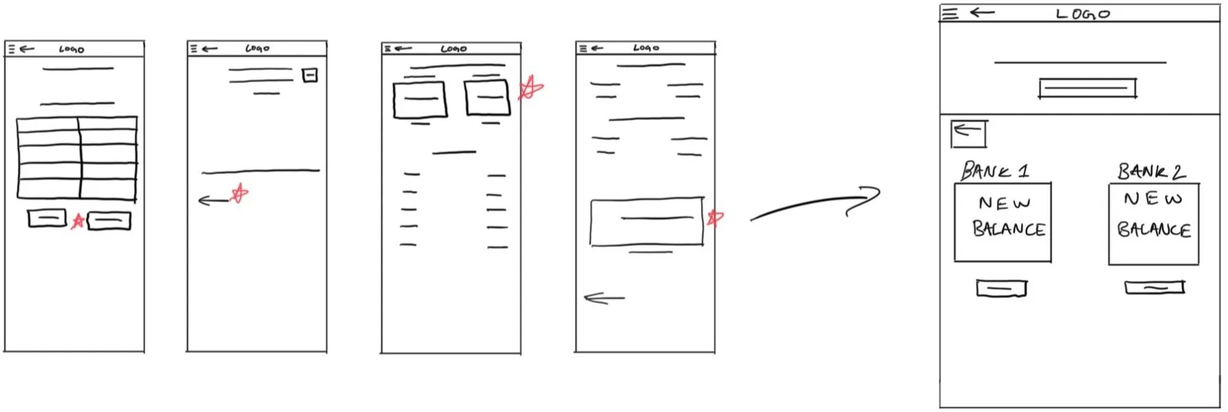
My design process followed a systematic approach that evolved through iterations based on user testing and feedback. From there, I developed the five pages required for a basic user flow (currency exchange order) through multiple lo-fi wireframe sketches for mobile, iterating on different layouts and user flows. By analyzing the strengths of each sketch, I synthesized the most effective elements into a single, refined lo-fi mobile wireframe sketch. With a strong mobile-first foundation, I adapted the design to desktop and app, carefully considering layout scalability and user behavior differences between devices.

The Login Page

The Homepage


The Confirmation Page


The Order Complete Page


Usability Testing
Following completion of the lo-fi prototype, I conducted a usability test, which played a crucial role in shaping ensuing design decisions by providing actionable insights into how users interacted with the product and how well it met their needs.
The Plan…
Introduction
Schedule:
Recruitment starts: January 2
Study dates: January 9
Results available: January 13
Author: Shavasp Quillen, Freelancer, shavaspquillen@gmail.com
Stakeholders: Currency Exchange service customers
Date: 01/01/2025
Project background: We’re creating a currency exchange service for users to quickly, easily and affordably transfer and exchange currencies between country specific bank accounts which will affect expats with foreign expenses by providing them with a variety of vertically integrated international banking services. We need to find out if the main user experience, exchanging currencies between bank accounts, is easy for users to complete. We’d also like to understand the specific challenges that users might face while withdrawing currencies in foreign countries.
Research goals: Determine if users can complete core tasks within the prototype of the currency exchange app. Determine if the currency exchange app is difficult to use.
Research Questions
How long does it take a user to exchange currencies?
What can we learn from the currency exchange user flow?
Are there parts of the user flow where users get stuck?
Are there more features that users would like to see included in the app?
Do users prefer our app to others?
Key Performance Indicators (KPI’s)
user engagement
transaction volume
customer satisfaction metrics
Methodology
Unmoderated usability study
Location: United States, remote (each participant will complete the study in their own home)
Date: Sessions will take place on January 9 (after hours)
Length: Each session will last 5 to 10 minutes, based on a list of prompts
Compensation: N/A
Participants
Participants are all expats
Three males and two females between the ages of 21 and 50
Script
During the unmoderated usability study a list of prompts appears on the device screen
Prompt 1: Login to the currency exchange app
Prompt 2: Convert your currency from one bank to another
Prompt 2 follow-up: How easy or difficult was this task to complete? Is there anything you would change about the process of converting currencies?
Prompt 3: Confirm currency exchange
Prompt 3 follow-up: How Easy or difficult was this task to complete? Is there anything you would change?
Prompt 4: From the confirmation page, figure out where you would go to return to the homepage
Prompt 5: How did you feel about this currency exchange service overall? What did you like and dislike about it?
Synthesizing Data & Design Improvements
The process of synthesizing data and iterating on the designs involved turning raw usability study data into actionable insights that directly shaped the design. I uncovered key themes about user needs and pain points utilizing pattern identification and prioritized insights notes to guide meaningful updates and enhancements, ensuring the design aligned with user expectations and delivered an improved experience.
Pattern Identification
It was observed that 3out of 5 participants thought the function of the buttons were unclear. This means that button purpose should be clarified.
It was observed that 2out of 5 participants felt that the text was illegible. This means that the size and contrast of the text should be increased.
It was observed that 3out of 5 participants thought that the homepage was too cluttered. This means that pages should be more minimalistic.
Prioritized Insights
Priority 0
Based on the theme that: users can not navigate the app due to unclear button functions, an insight is: that button purpose should be clarified.
Based on the theme that: text was illegible, an insight is that: text size and color should be adjusted.
Priority 1
Based on the theme that: users felt that the homepage was messy, an insight is that: design and gestalt principles should be applied to the homepage.
Responsive Wireframes
Following the usability testing, I revised the lo-fi wireframes into adaptive hi-fi mockups. At this stage, I incorporated brand colors, typography, and product imagery, bringing the design closer to its final, polished form.

The Login Page

The Homepage

The Confirmation Page

