
Gaming Equipment App: SOTA
PROJECT OVERVIEW
End-to-End UX Designer (Independent Project): product design, user research, wireframing, prototyping.
Role:
Summer 2024
Time:
Sota is a vertically integrated gaming marketplace and information center for a range of users, from budget-conscious professionals to retro gaming enthusiasts to tech-savvy individuals who all enjoy gaming.
Product:
Goal
The purpose of this project was to design a gaming equipment app and e-commerce website tailored to diverse user groups, including budget-conscious young professionals, retro gaming enthusiasts, and senior professionals. By incorporating advanced product research tools, a dedicated portal for legacy gaming content, and a tech news subscription service with integrated checkout, the platform aims to address each group’s unique needs. Effectiveness will be measured through conversion rates, legacy product sales, and subscription engagement metrics.
Problem
This project addresses the need for a user-friendly gaming marketplace that provides easy access to a diversified offering of gaming equipment, and industry news—all while catering to varying levels of technical knowledge and lifestyle constraints.
USER RESEARCH


During my user research I conducted a series of in-depth interviews with a diverse participants consisting of a representative sample of the target user. A screening survey was employed to ensure that all interviewees had at some point in their lives purchased gaming equipment. Initially, it was assumed that the primary user base would consist mainly of young, tech-savvy individuals who are avid gamers. However, the research revealed a much broader audience, including older adults seeking gaming equipment for their children, casual gamers looking for occasional entertainment, and even non-gamers purchasing gifts for loved ones. I employed open-ended interviews to understand their needs, preferences, and pain points. This approach not only validated some of the initial hypotheses but also challenged me to consider a wider array of user scenarios and design requirements, ultimately guiding me towards a more inclusive and user-friendly product.
Audience
This design project aimed to address the needs of users seeking a platform that balances affordability, nostalgia, and innovation in gaming. The solution focused on providing access to high-quality, budget-friendly gaming equipment, while also offering features that enable users to reconnect with classic gaming experiences and stay informed about the latest technology trends. By incorporating advanced research tools, dedicated support for legacy content, and easy access to new gaming trends in a vertically integrated format, the platform was designed to cater to diverse preferences and use cases, enhancing the gaming ecosystem for a wide range of users.
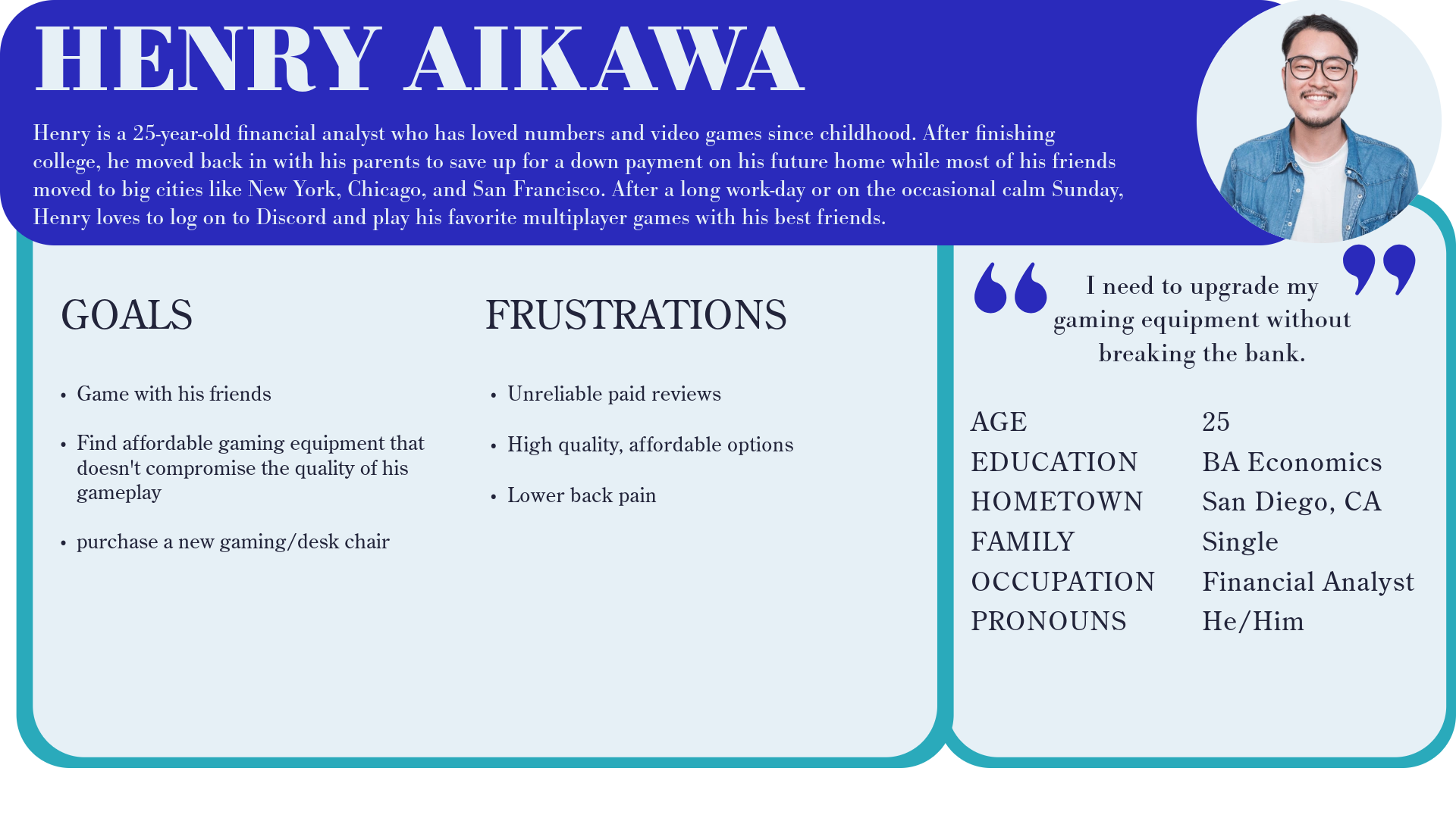
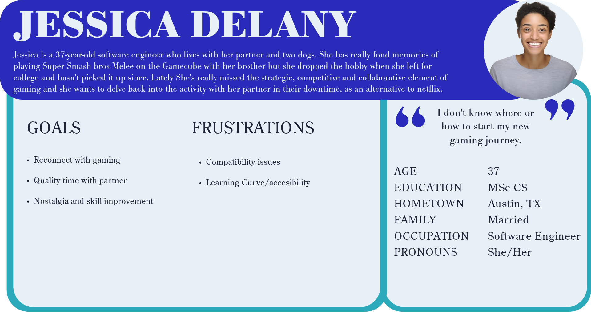
Personas
Three user personas were constructed to represent diverse gaming needs goals and characteristics. One persona is a young professional who enjoys gaming as a way to unwind, while also managing financial goals. Another persona seeks to reconnect with nostalgic gaming experiences and engage in strategic, collaborative play with a partner. The third persona is an experienced gamer who stays up to date with the latest gaming technology and enjoys bonding with family through gaming. These personas were central to shaping a versatile platform designed to meet various gaming demands.

Empathy Maps

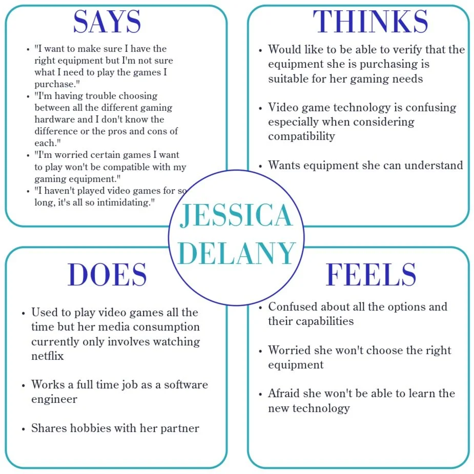
Empathy maps help visualize users' psyches, enabling a deeper understanding of their needs and pain points to inform user-centered design decisions.

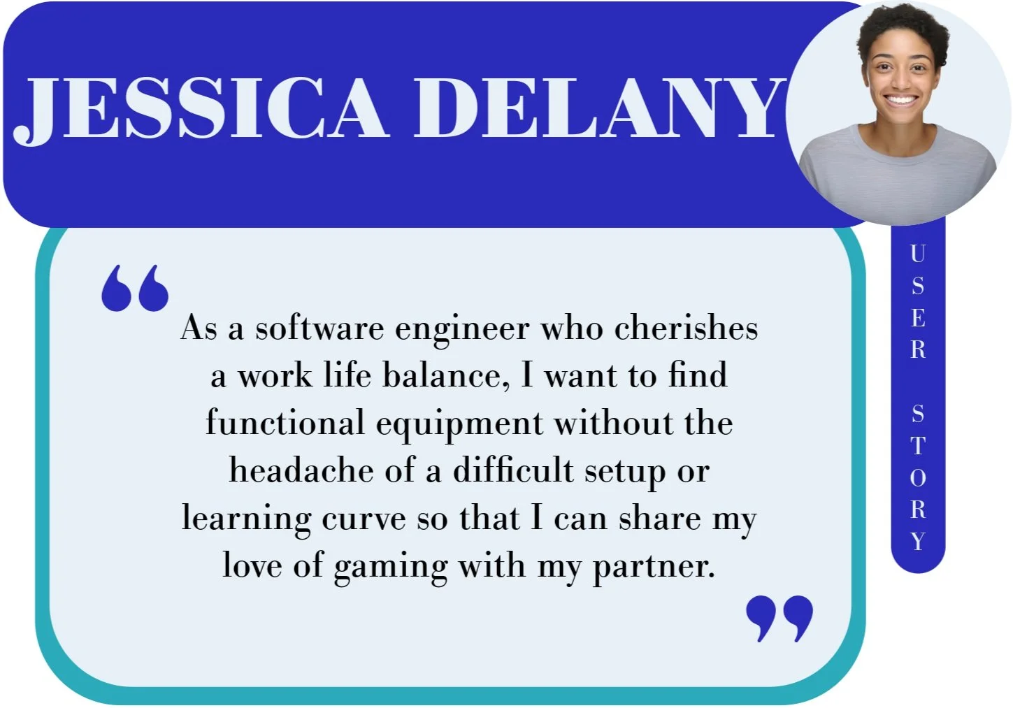
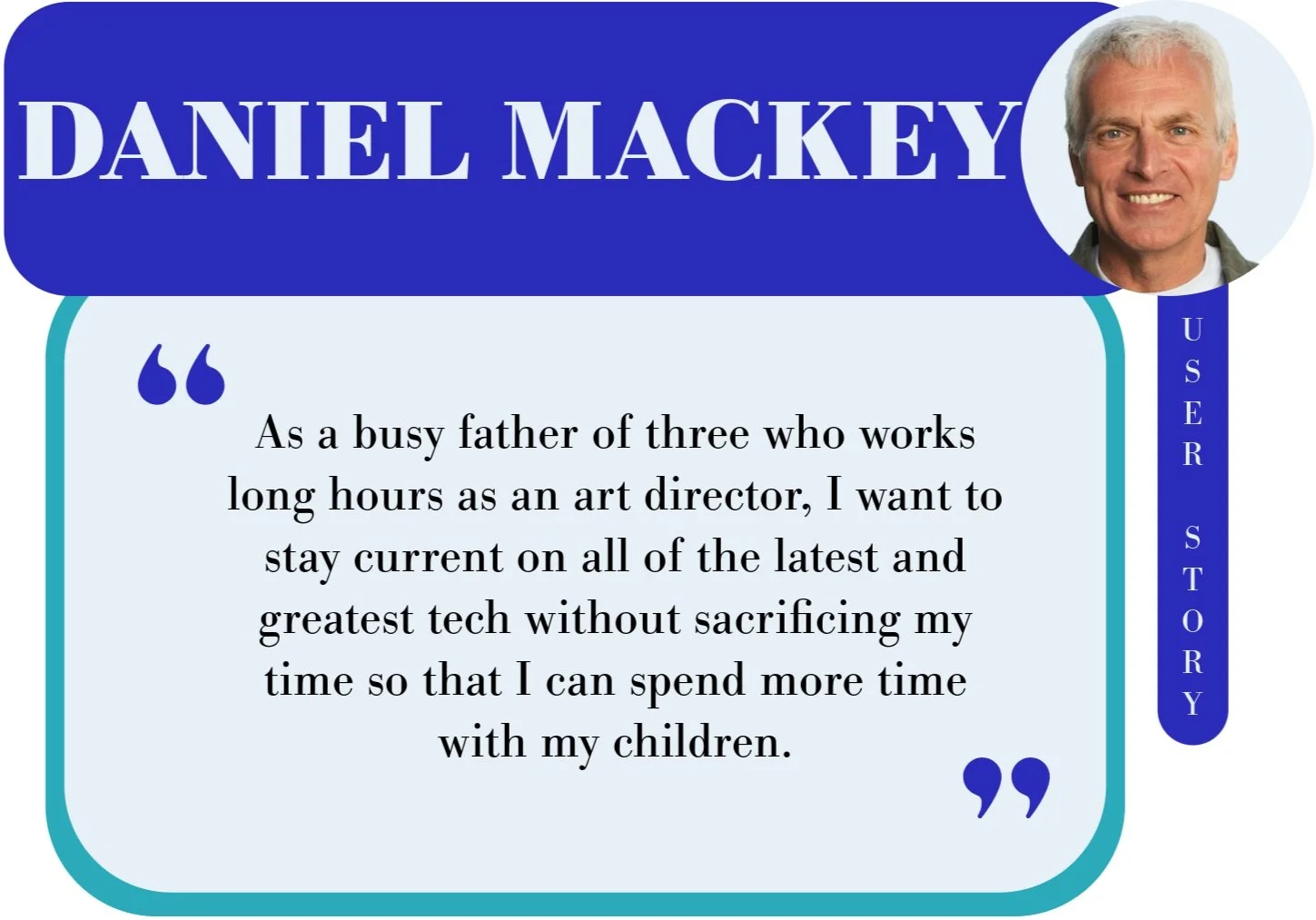
User Stories
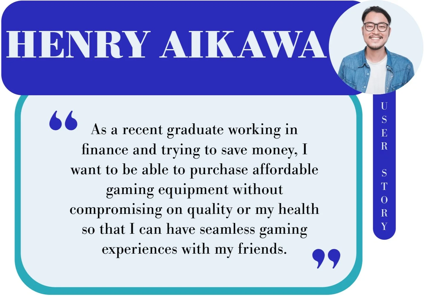
User stories inform more user-centered design decisions by assisting in the conceptualization of users' psyches, enabling a deeper understanding of the basis of users’ goals and the inhibitors to the fulfillment of users’ goals.
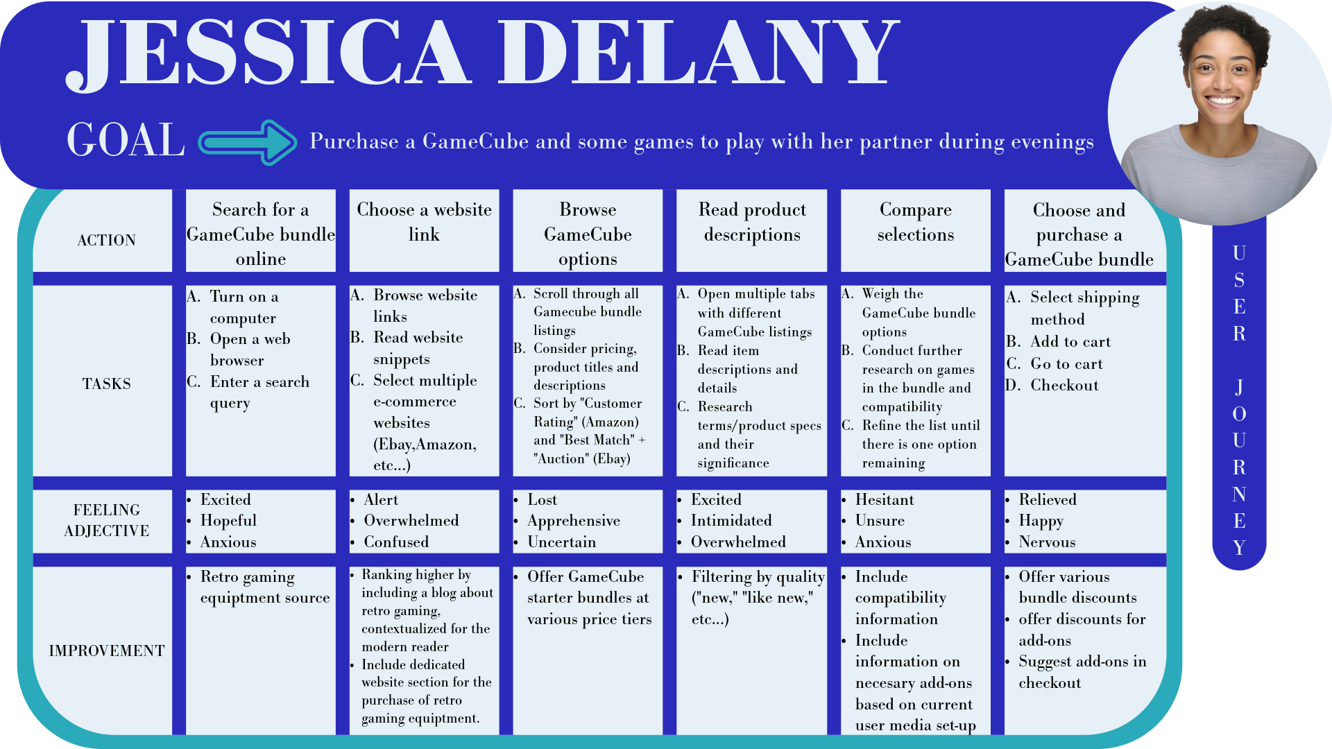
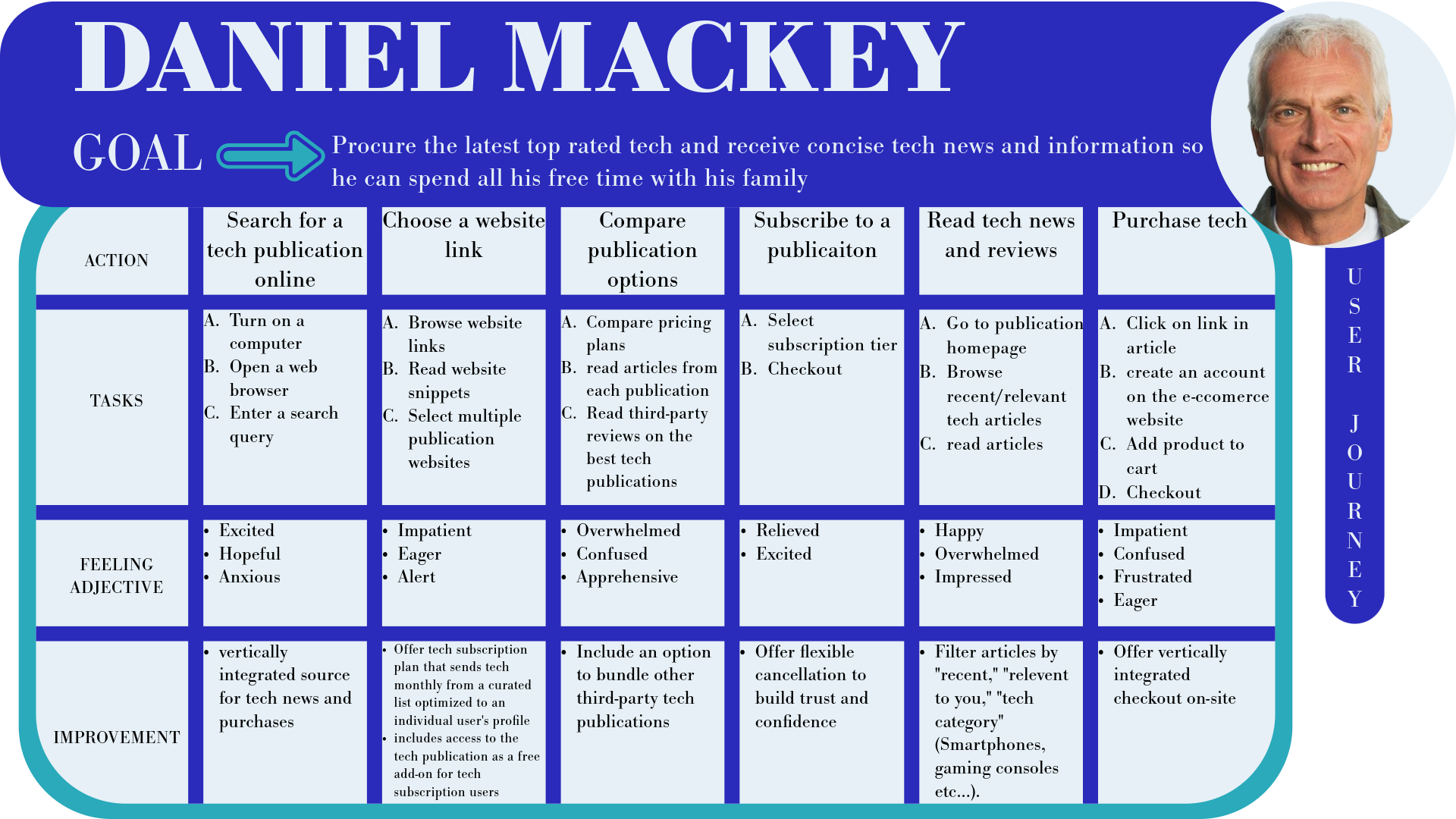
User Journeys

User journeys map out the steps users take to achieve their goals, highlighting pain points and opportunities to improve the overall user experience.
DEFINING THE PROBLEM
Defining user needs is an essential constituent of any effective design process. Through problem statements, hypothesis statements, and goal statements, this project identifies and addresses key user challenges, ensuring a user-centered methodology in the formation of value propositions that represent compelling design solutions.
Problem Statements
I have developed a problem statement for each of the three user personas, defining their unique challenges and needs to create a focused and user-centered design solution. These problem statements, rooted in empathy and user research, help identify key goals, constraints, and criteria that guide the design process. By clearly articulating what users need and why those needs matter, these statements ensure that the design remains aligned with real user problems before moving into the ideation phase.
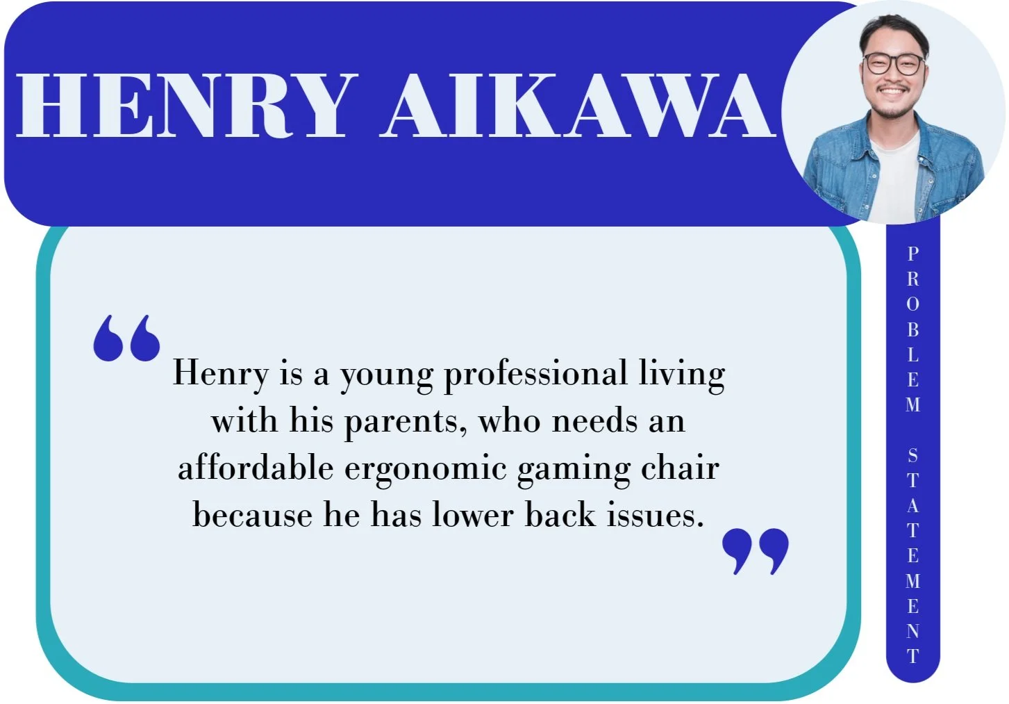
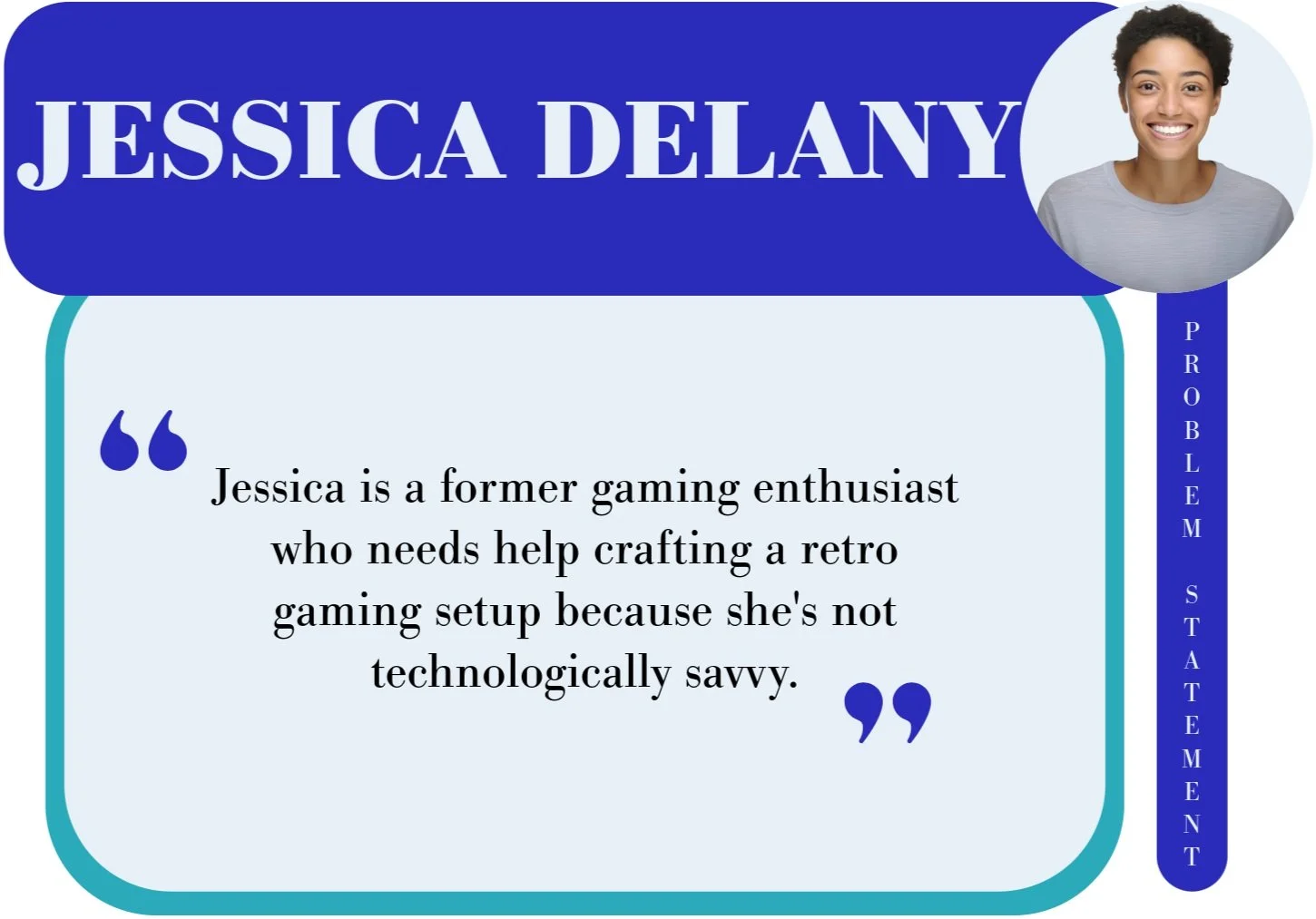

Hypothesis Statements

After identifying key user needs through problem statements, I developed hypothesis statements to propose potential solutions. These statements outline how I might address user challenges and improve their experience. By setting clear expectations for the impact of my design, they provide a strong foundation for brainstorming, testing, and refining solutions in the next phase of the process.
Value Propositions
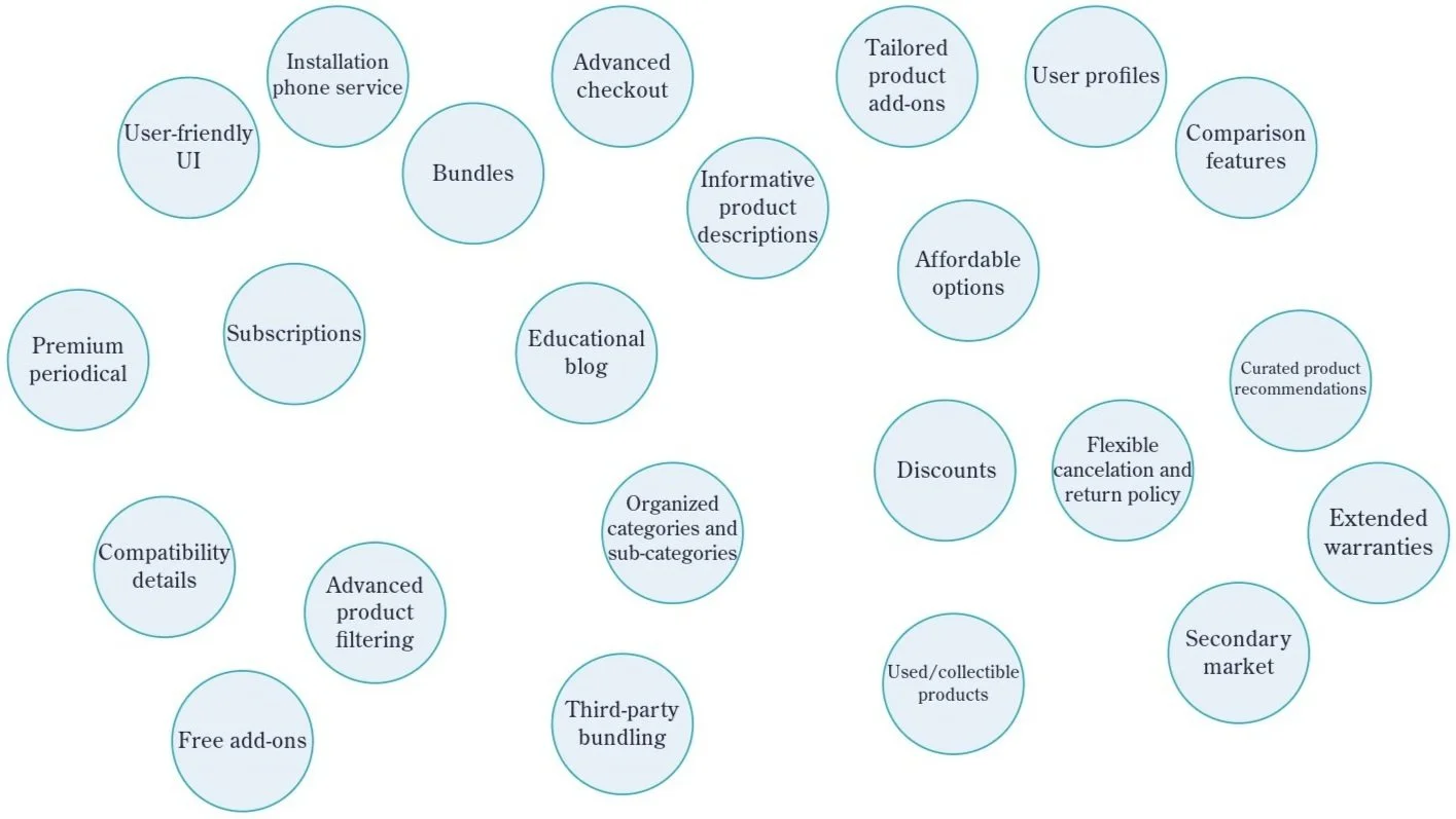
In order to ensure meaningful and impactful user experiences, I propose specific design implementations as direct solutions to the user needs divulged in the hypothesis statements.
Categorizing value propositions…

Attributing to each individual persona…

Goal Statements
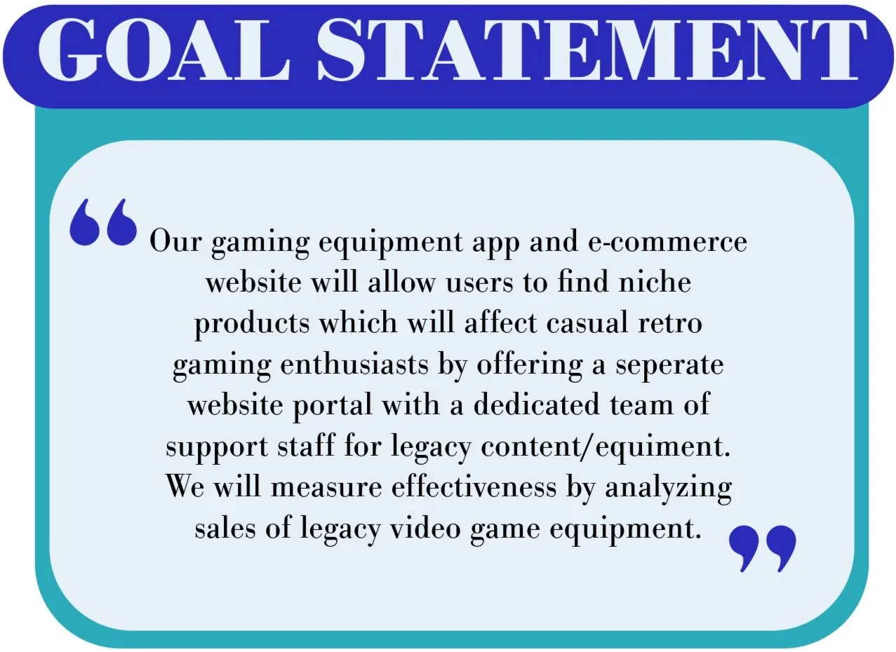
For each of the three personas, I developed goal statements that transform the hypotheses into clear, actionable objectives. These goals are designed to directly address the user needs identified earlier in the problem statements, ensuring the product delivers the desired results. By setting specific targets, I can focus the design process on achieving meaningful outcomes that align with both user expectations and the project’s broader vision.
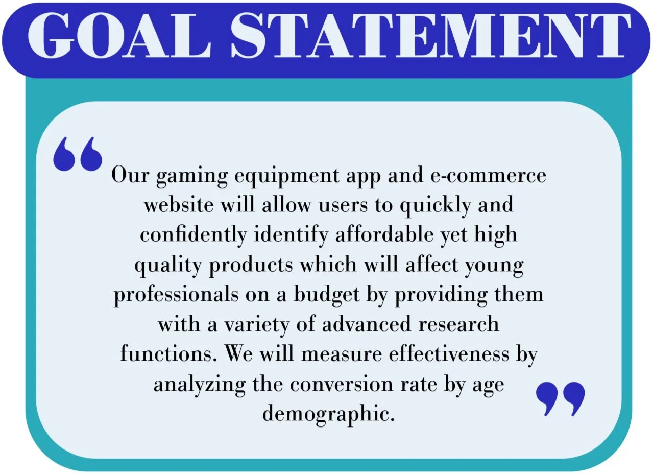

IDEATING SOLUTIONS
The ideation phase marks a critical step in the design process, where creativity and innovation take center stage. Building on the insights gathered from user research, problem statements, and goal setting, this phase encourages the generation of a wide range of potential solutions without judgment or limitation. I utilized competitive audits, and brainstorming tactics to aid and expand upon design possibilities, understanding of industry trends, and spark fresh approaches to addressing user challenges. By exploring numerous ideas, the goal was to unlock the most effective and impactful solutions for the final product.
The Competitive Audit:
Objective
The audit aimed to assess the strengths and weaknesses of key competitors in the gaming equipment market to identify opportunities for differentiation and market positioning for a new gaming equipment marketplace app.
Competitors Analyzed

Micro Center
Direct Competitor

Amazon
Indirect Competitor

Best Buy
Indirect Competitor
GameStop
Direct Competitor
Key Findings:
GameStop and Micro Center specialize in gaming and PC equipment, while Best Buy and Amazon offer broader tech and general merchandise
Product Offering
Amazon has the most user-friendly and responsive mobile interface
Best Buy and GameStop provide intuitive navigation, although GameStop's desktop experience is dense with information
Micro Center lags behind with dated visual design and less intuitive navigation
User Experience
Best Buy and Amazon excel in accessibility with multiple language options and screen reader optimization. GameStop and Micro Center need improvements in language offerings and general accessibility
Accessibility
GameStop, Best Buy, and Amazon maintain strong, recognizable brand identities. Micro Center's visual design is outdated, affecting the overall user appeal
Visual Design
GameStop provides playful and succinct content, aligning well with its audience, whereas Amazon's tone is more informational. Micro Center’s content is direct but can be overwhelming due to its focus on product features while Best Buy's content is fun and promotional, with detailed product specs, though consistency varies across categories
Content
GameStop emphasizes community and trade-ins, Best Buy focuses on expert service, Amazon highlights convenience and variety, and Micro Center caters to tech enthusiasts with a strong focus on PC equipment
Market Positioning
GameStop’s community presence and niche collectibles.
Best Buy’s expert service and retail footprint.
Amazon’s vast selection and efficient logistics.
Micro Center’s tech expertise and specialized offerings.
Strengths
GameStop’s limited online presence and pricing issues.
Best Buy’s online experience not matching its physical stores.
Amazon’s overwhelming choices and inconsistent product quality.
Micro Center’s limited locations and dated branding.
Weaknesses
Gaps & Opportunities:
Lack of personalized shopping experiences
Limited integration of gaming communities
Insufficient focus on niche gaming products
Implement advanced search and personalized recommendations
Develop community engagement through blogs and newsletters
Expand product offerings to include niche markets such as retro gaming equipment
Enhance product support with features like compatibility guides and installation assistance
Conclusion
The competitive landscape presents a significant opportunity for a new gaming equipment marketplace to differentiate by focusing on personalization, community engagement, and catering to niche gaming segments.
Ideation Activities:
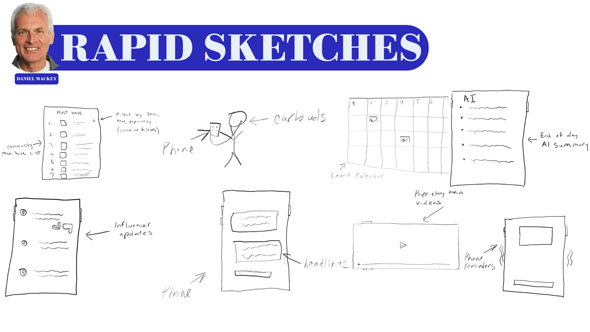
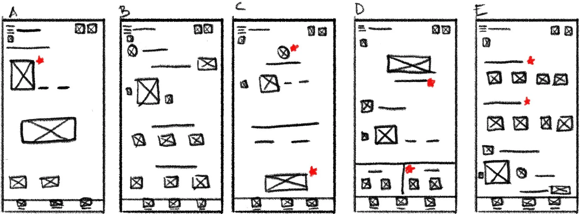
To guide the ideation process, I utilized two proven ideation techniques: "How Might We" questions and Rapid Sketching. These methods aided in the exploration of a wide range of design possibilities, encouraging creative thinking and visualizing potential solutions to user problems. Below I showcase Daniel’s “How Might We” and “Rapid Sketch.”

DESIGN PROTOTYPING
During the prototyping phase, I started by mapping out the user flow to ensure a seamless experience through the product. I used storyboarding to visualize each step of the user’s journey, which helped in identifying key interactions and touchpoints. Next, I created sitemaps to establish a clear structure for the content and navigation. With this foundation in place, I moved on to wireframing, crafting basic layouts to represent the interface and functionality. These wireframes served as the blueprint for more detailed prototypes, which I used to simulate the user experience and gather valuable feedback for iterative improvements.
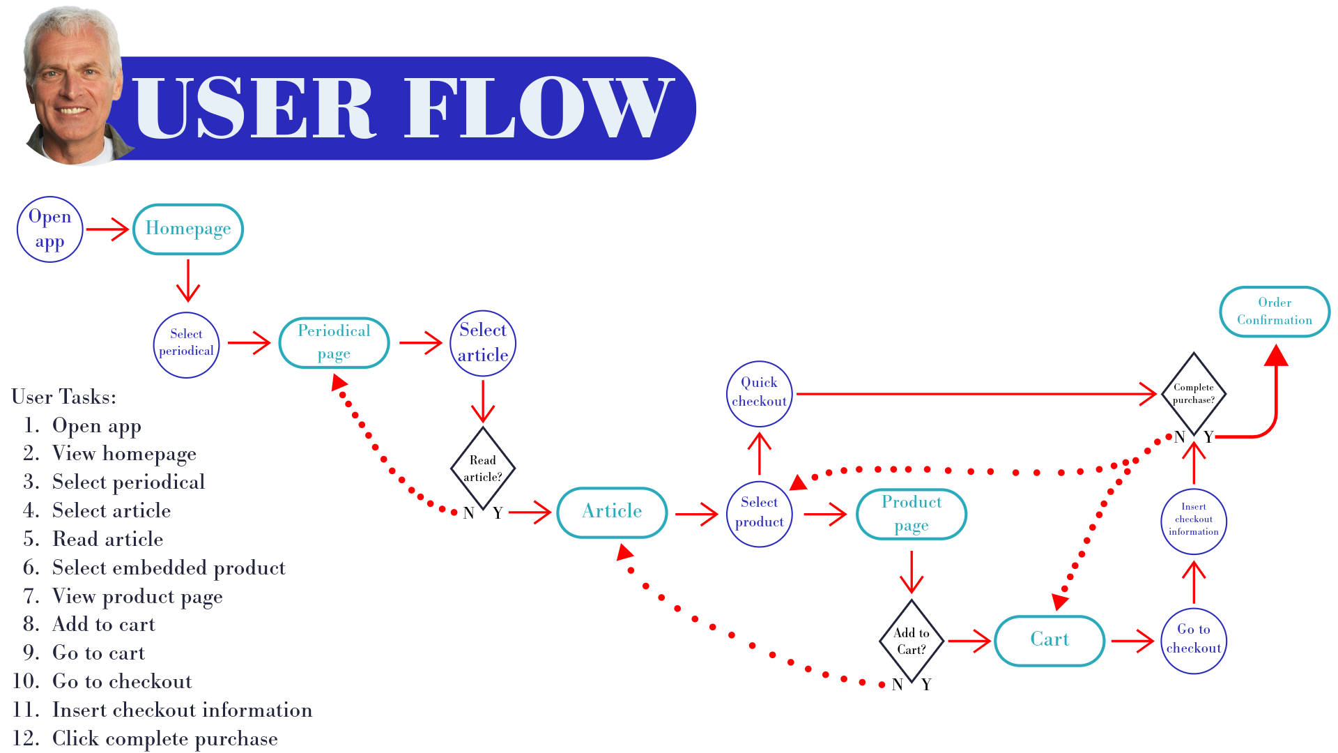
The user flow diagram helped me map the key steps users would take, ensuring smooth navigation and identifying areas for improvement in the experience.
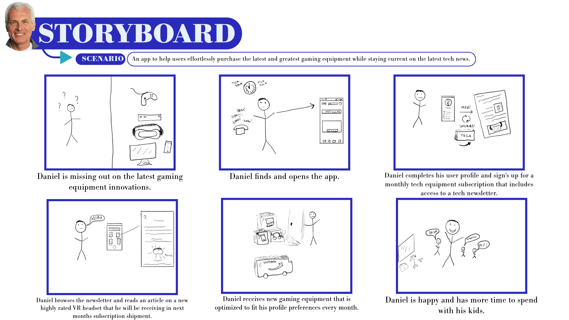
The storyboard diagram allowed me to dive deeper into the user's journey, illustrating their interactions with the product alongside their context, emotions, and needs. By crafting a narrative around a user persona, I showcased their environment, challenges, and outcomes, highlighting how the design addressed their goals and enhanced their experience.
Sitemap
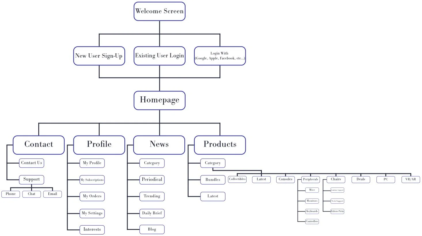
The sitemap gave me a clear overview of the product’s entire structure, outlining how information was organized, prioritized, and connected. By mapping out the architecture, I identified how content was grouped, the hierarchy between sections, and the pathways users would take to navigate the system. This process helped me plan the individual screens to design and ensure seamless connections for an intuitive prototype.
Early Wireframes
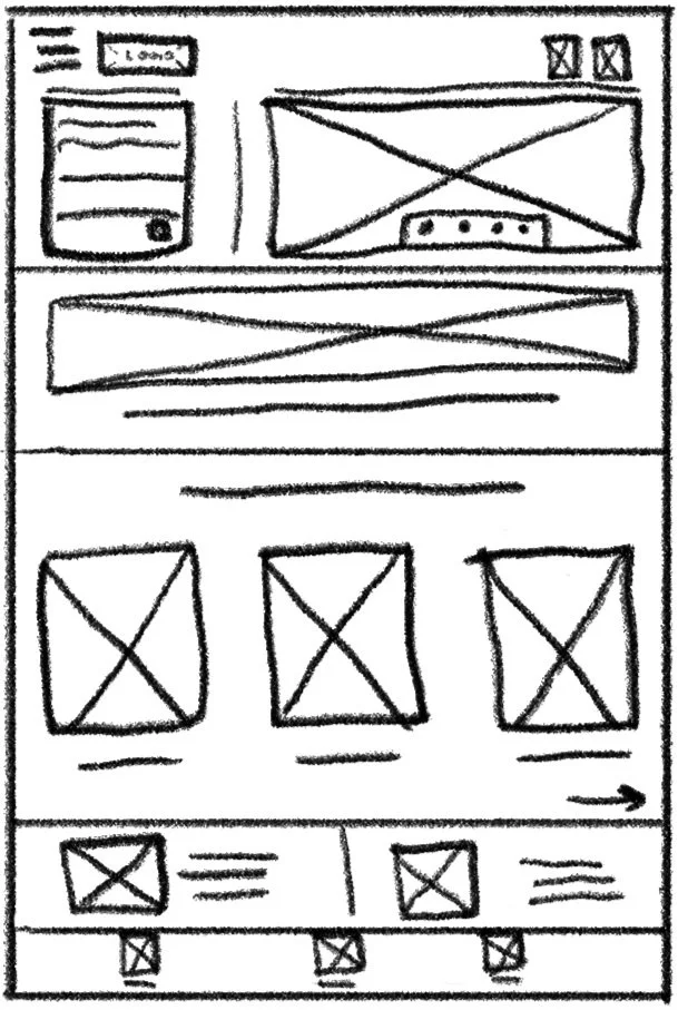
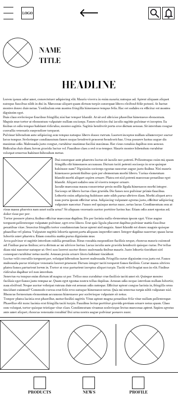
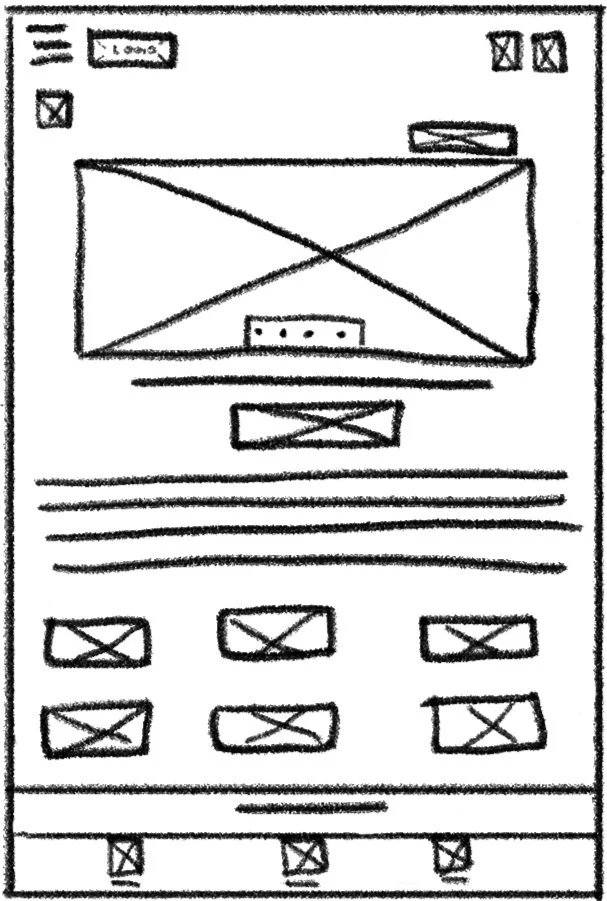
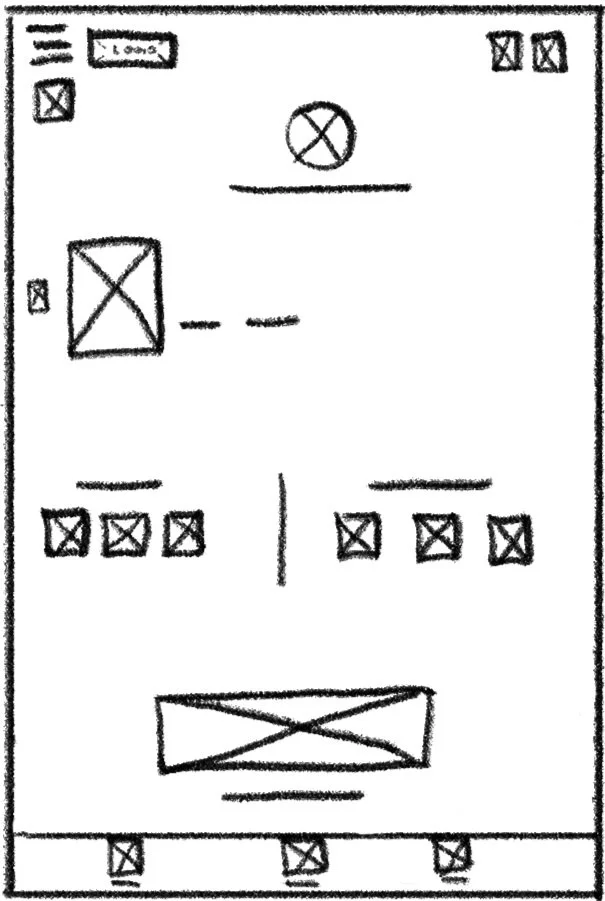
My design process followed a systematic approach that evolved through iterations based on user testing and feedback. Initially, I developed the five app pages required for a basic user flow (product checkout via article) from sketches to digital low-fi wireframes.

The Homepage


The News Page

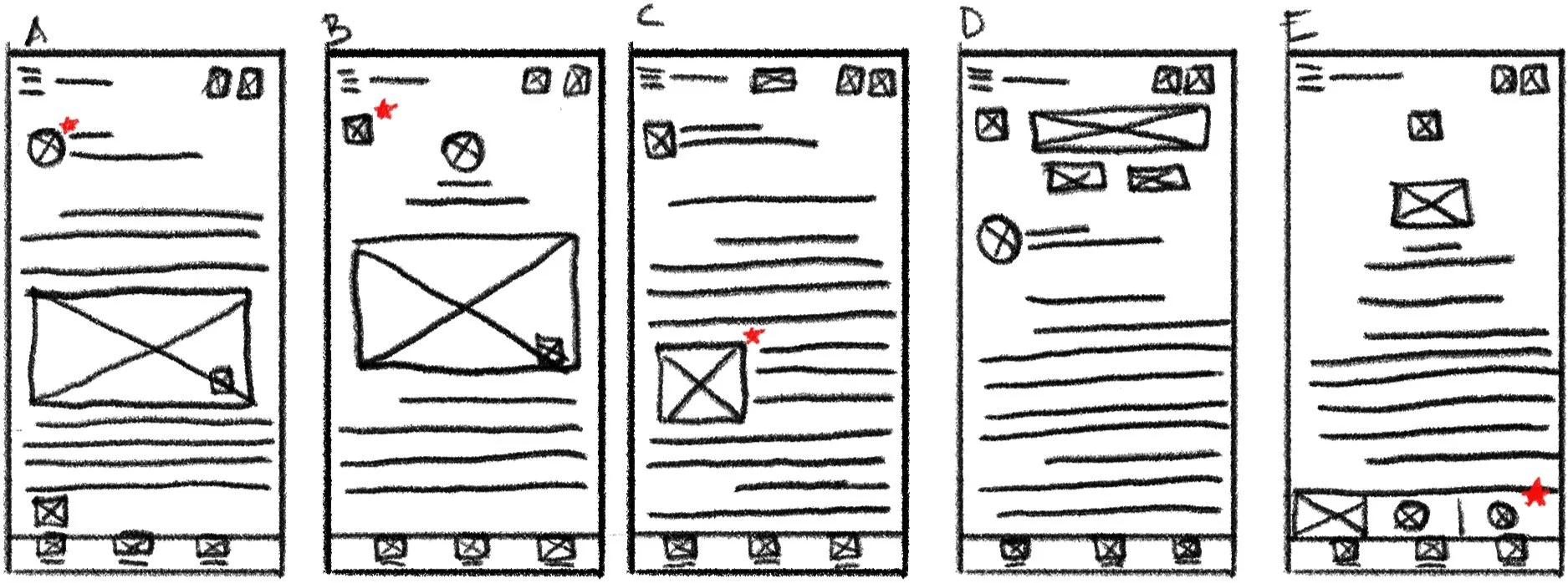
The Article Page


The Product Page

The Cart Page

Initial Usability Testing
Following completion of the lo-fi prototype, I conducted the first usability test, which played a crucial role in shaping ensuing design decisions by providing actionable insights into how users interacted with the product and how well it met their needs.
The Plan…
Introduction
Schedule:
Recruitment starts: September 2
Study dates: September 9
Results available: September 13
Author: Shavasp Quillen, Freelancer, shavaspquillen@gmail.com
Stakeholders: Gaming equipment app customers
Date: 8/28/2024
Project background: We’re creating a gaming equipment app to help people quickly identify and acquire what they need by offering a vertically integrated marketplace and information hub for gaming equipment. We need to find out if the main user experience, researching and purchasing gaming equipment, is easy for users to complete. We’d also like to understand the specific challenges that users might face in the researching and purchasing processes.
Research goals: Determine if users can complete core tasks within the prototype of the gaming equipment app. Determine if the gaming equipment app is difficult to use.
Research Questions
How long does it take a user to research and purchase a product?
What can we learn from the purchasing user flow?
Are there parts of the user flow where users get stuck?
Are there more features that users would like to see included in the app?
Do users prefer our app to others?
Key Performance Indicators (KPI’s)
User Error rates
Conversion rate
Time on Task
Net Promoter Score
Methodology
Unmoderated usability study
Location: United States, remote (each participant will complete the study in their own home)
Date: Sessions will take place on September 12 (after hours)
Length: Each session will last 5 to 10 minutes, based on a list of prompts
Compensation: N/A
Participants
Participants are all gaming enthusiasts with full-time jobs who purchase new tech at least once a year
Three males and two females between the ages of 27 and 60
Script
During the unmoderated usability study a list of prompts appears on the device screen
Prompt 1: Read an article about a new piece of gaming equipment
Prompt 1 follow-up: How easy or difficult was this task to complete? Is there anything you would change about the process of selecting an article to read?
Prompt 2: Select a product to purchase
Prompt 3: Add a product to your cart and complete the checkout process.
Prompt 3 follow-up: How Easy or difficult was this task to complete? Is there anything you would change?
Prompt 4: From the home page, figure out where you would go to edit your shipment details.
Prompt 5: How did you feel about this gaming equipment app overall? What did you like and dislike about it?
Synthesizing Data & Design Improvements: Round 1
The process of synthesizing data and iterating on the designs involved turning raw usability study data into actionable insights that directly shaped the design. By organizing interview notes, visualizing findings with affinity diagrams, and identifying patterns, I uncovered key themes about user needs and pain points. These insights were prioritized to guide meaningful updates and enhancements, ensuring the design aligned with user expectations and delivered an improved experience.
Affinity Diagram
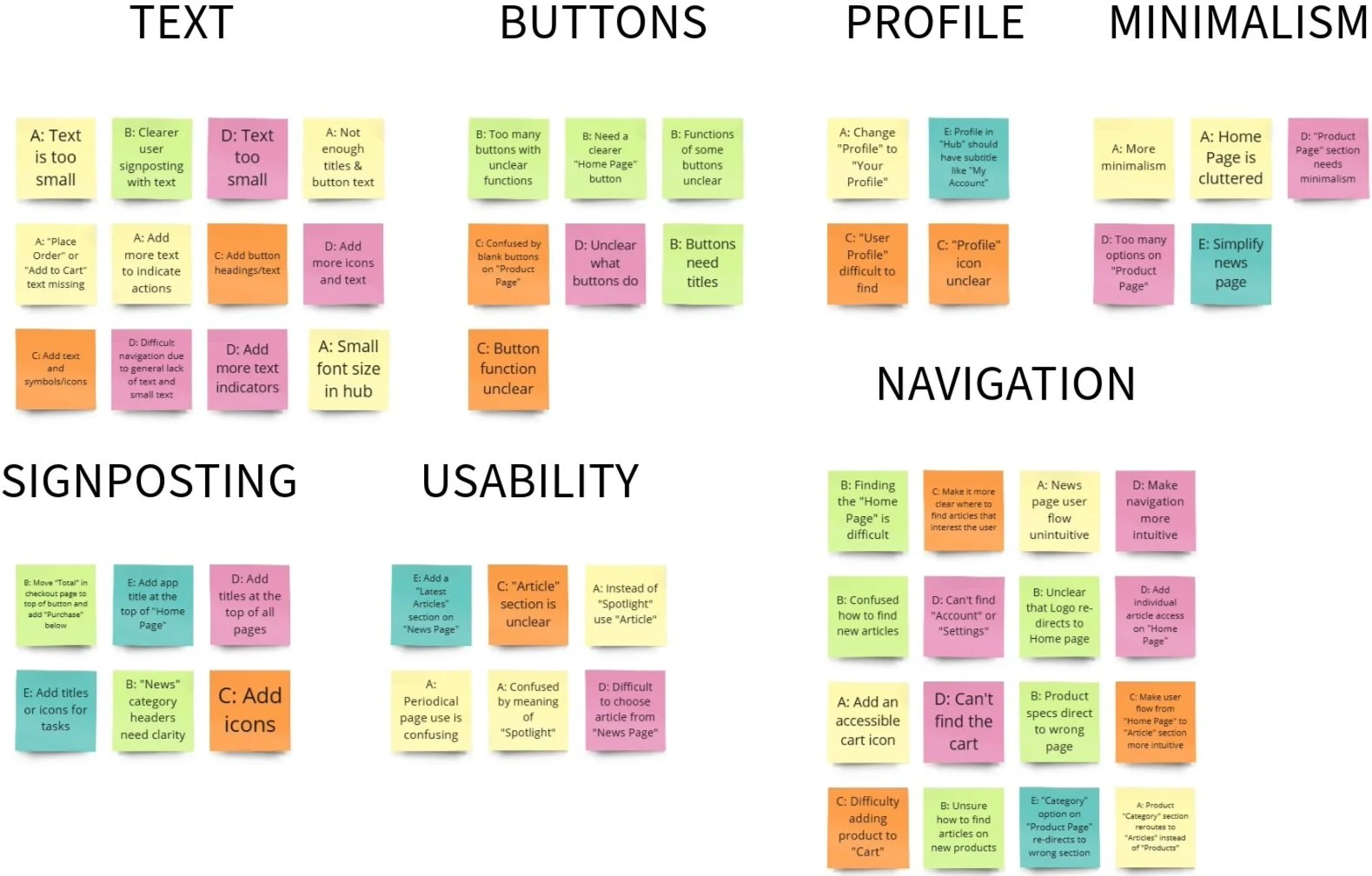
The affinity diagram allowed me to organize scattered research data into meaningful, actionable insights. By grouping related observations, I uncovered patterns and themes that informed my next design choices.
Pattern Identification
It was observed that 5 out of 5 participants found article selection to be tedious or difficult. This means that the article page should be more intuitive.
It was observed that 4 out of 5 participants wished for more icons for usability and navigation. This means that icons need to be added to the UI.
It was observed that 3 out of 5 participants thought the function of the buttons were unclear. This means that button purpose should be clarified.
It was observed that 4 out of 5 participants felt that the text was either too difficult to decipher or that there wasn’t enough text. This means that the amount of text and the size of the text should be increased.
It was observed that 3 out of 5 participants struggled to add items to Cart. This means that the cart function needs to be more accessible.
It was observed that 3 out of 5 participants thought that one or more pages were too cluttered. This means that pages should be more minimalistic.
It was observed that 2 out of 5 participants could not finish their task because an option on the product page redirected to the wrong section. This means that there is a navigation error that needs to be resolved.
Prioritized Insights
Priority 0
Based on the theme that: Users were unsatisfied with the article selection process, an insight is: that the news page should be simplified for intuitive article browsing.
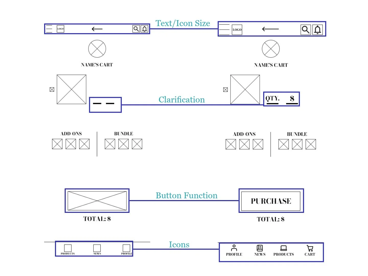
Based on the theme that: users struggled with adding items to their cart, an insight is: that the cart should be more accessible and the “add to cart” function should be improved.
Based on the theme that: product page options redirected users to the wrong section, an insight is: that a prototype interaction error needs to be resolved.
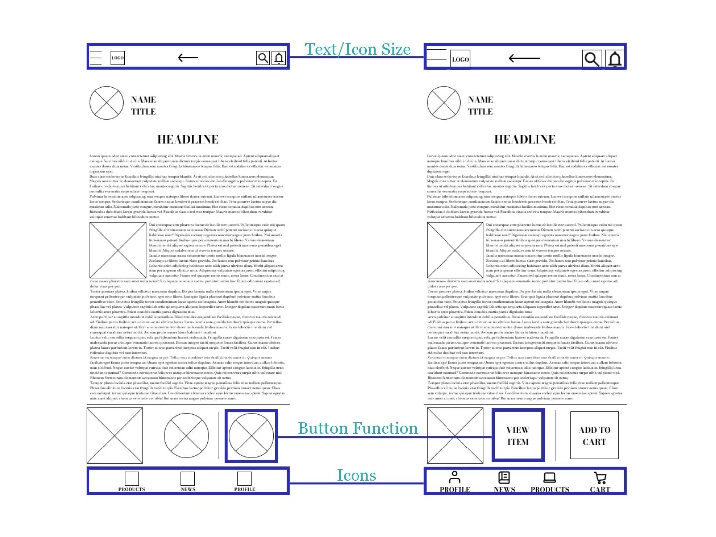
Based on the theme that: Users can not navigate the app due to small or nonexistent text, an insight is: that text size and frequency should be increased.
Based on the theme that: users were unsure what the functions of various buttons were, an insight is: that button function should be clarified.
Priority 1
Based on the theme that: users felt that there were not enough icons, an insight is: that adding more icons to the UI would make use of the app more enjoyable and intuitive.
The Homepage

The News Page

The Article Page
The Product Page

The Cart Page
Final Usability Testing
After revising the lo-fi prototypes based on the learnings from the first usability test, I planned a second usability study to inform the upcoming transition to hi-fi prototypes.
The Plan…
Introduction
Schedule:
Recruitment starts: September 16
Study dates: September 19
Results available: September 23
Author: Shavasp Quillen, Freelancer, shavaspquillen@gmail.com
Stakeholders: Gaming equipment app customers
Date: 9/16/2024
Project background: We’re creating a gaming equipment app to help people quickly identify and acquire what they need by offering a vertically integrated marketplace and information hub for gaming equipment. We need to find out if the main user experience, researching and purchasing gaming equipment, is easy for users to complete. We’d also like to understand the specific challenges that users might face in the researching and purchasing processes.
Research goals: Determine if users can complete core tasks within the prototype of the gaming equipment app. Determine if the gaming equipment app is difficult to use.
Research Questions
How long does it take a user to research and purchase a product?
What can we learn from the purchasing user flow?
Are there parts of the user flow where users get stuck?
Are there more features that users would like to see included in the app?
Do users prefer our app to others?
Key Performance Indicators (KPI’s)
User Error rates
Conversion rate
Time on Task
Net Promoter Score
Methodology
Unmoderated usability study
Location: United States, remote (each participant will complete the study in their own home)
Date: Sessions will take place on September 19 (after hours)
Length: Each session will last 5 to 10 minutes, based on a list of prompts
Compensation: N/A
Participants
Participants are all gaming enthusiasts with full-time jobs who purchase new tech at least once a year
Three males and two females between the ages of 21 and 59
Script
During the unmoderated usability study A list of prompts appears on the device screen
Prompt 1: Read an article about a new piece of gaming equipment
Prompt 1 follow-up: How easy or difficult was this task to complete? Is there anything you would change about the process of selecting an article to read?
Prompt 2: Select a product to purchase
Prompt 3: Add a product to your cart and complete the checkout process.
Prompt 3 follow-up: How Easy or difficult was this task to complete? Is there anything you would change?
Prompt 4: From the home page, figure out where you would go to edit your shipment details.
Prompt 5: How did you feel about this gaming equipment app overall? What did you like and dislike about it?
Synthesizing Data & Design Improvements: Round 2
The methods employed to synthesize data and iterate on the designs of the first lo-fi prototype was repeated following the completion of the final usability study, in order to inform the final design of the hi-fi prototypes.
Affinity Diagram
Once more, I used affinity diagraming to organize the final research data into meaningful, actionable insights. By grouping related observations, I uncovered additional patterns and themes that informed and aided in the completion of the final designs.

Pattern Identification
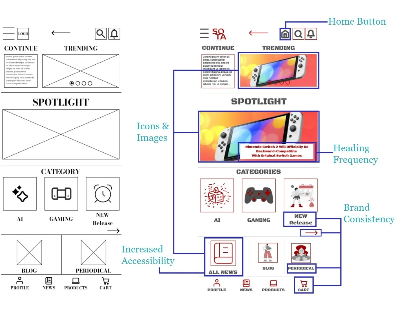
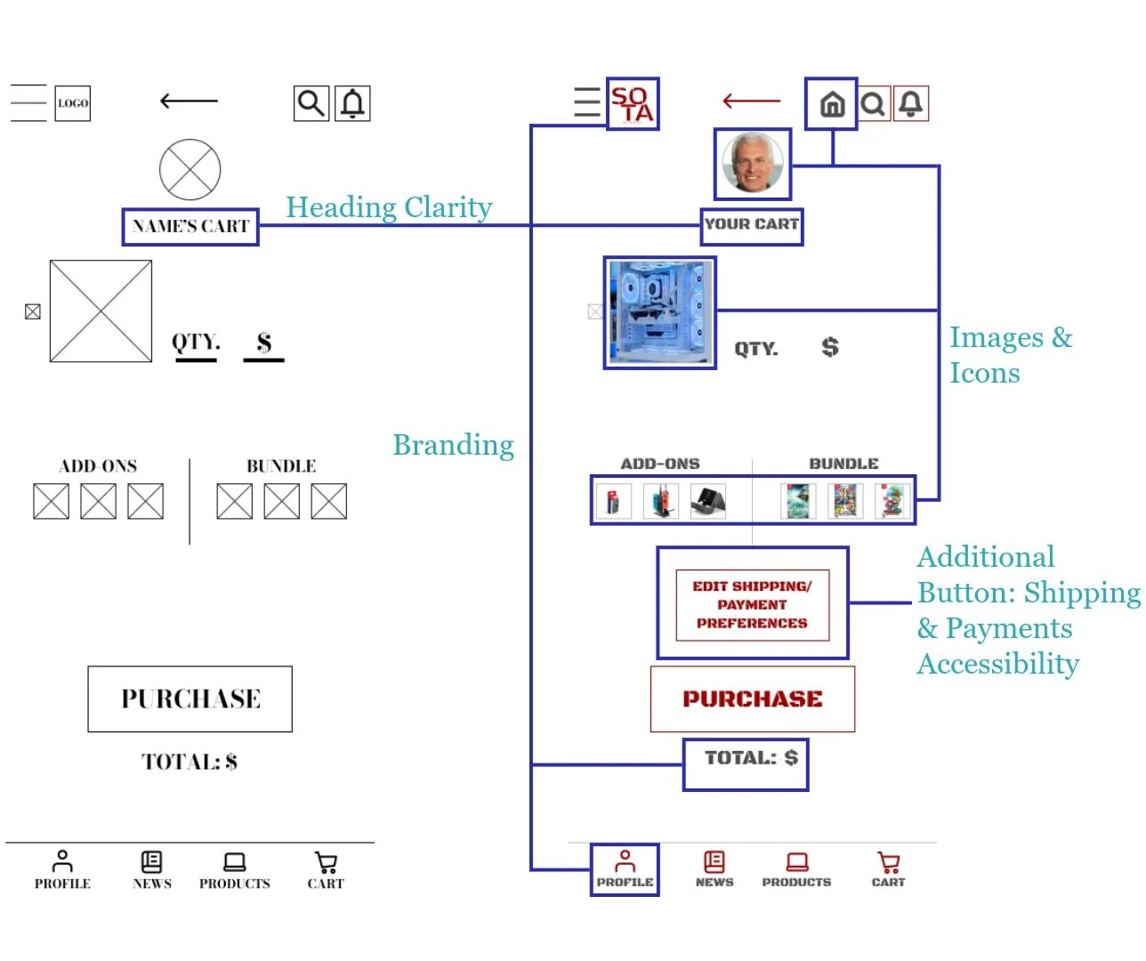
It was observed that 4 out of 5 participants felt that headings were either unclear or too scarce. This means that heading clarity and frequency needs to be improved.
It was observed that 2out of 5 participants thought the visual aesthetic of certain text was unappealing. This means that brand consistency needs to be refined.
It was observed that 1out of 5 participants expressed a need for increased accessibility. This means that adding more buttons to the UI would make use of the app more enjoyable and intuitive.
It was observed that 4 out of 5 participants were unhappy with payments and shipping options. This means that the user checkout flow and personal details section both require payments and shipping improvements.
It was observed that 2out of 5 participants were unable to find the “All Products” view. This means that the process of accessing the “All Products” view should be simplified.
Prioritized Insights
Priority 0
Based on the theme that: signposting is unclear, an insight is: that heading clarity and frequency needs to be improved.
Based on the theme that: the visual aesthetic of certain text is unappealing, an insight is: that brand consistency should be refined.
Based on the theme that: users were displeased with payments and shipping accommodations, an insight is: that shipping and payment edits should be added to the user checkout flow and revamped in the personal details section.
Based on the theme that: users were unable to find the “All Products” view, an insight is: that the process of accessing the “All Products” section should be simplified.
Priority 1
Based on the theme that: some users expressed a need for increased accessibility, an insight is: that adding more buttons to the UI would make use of the app more enjoyable and intuitive.
The Homepage

The News Page
The Article Page

The Products Page

The Product Page

The Cart Page
The Final Prototype
Product Purchase
Hub
Product Purchase (News)
Profile
Browsing
Final Thoughts
This project reinforced the importance of user research in uncovering unexpected audience segments and shaping a more inclusive design strategy. Initially, I assumed the primary users would be young, tech-savvy gamers, but research revealed a much broader spectrum—including nostalgic gamers reconnecting with past experiences, budget-conscious professionals balancing financial priorities, and older adults navigating gaming for themselves or their families. By addressing these diverse needs, the final design integrates affordability, nostalgia, and innovation into a seamless user experience.
Next Steps
Following the conclusion of this project, continued usability testing would be essential to validate design assumptions and refine the user experience based on real interactions. Conducting A/B testing on key features, such as advanced product filtration options would help optimize functionality and engagement. Additionally, gathering feedback from a broader audience, including less tech-savvy users, would ensure accessibility across all demographics. Finally, implementing analytics tracking for conversion rates, legacy product sales, and subscription engagement would provide data-driven insights to further enhance the platform’s effectiveness and long-term success.
